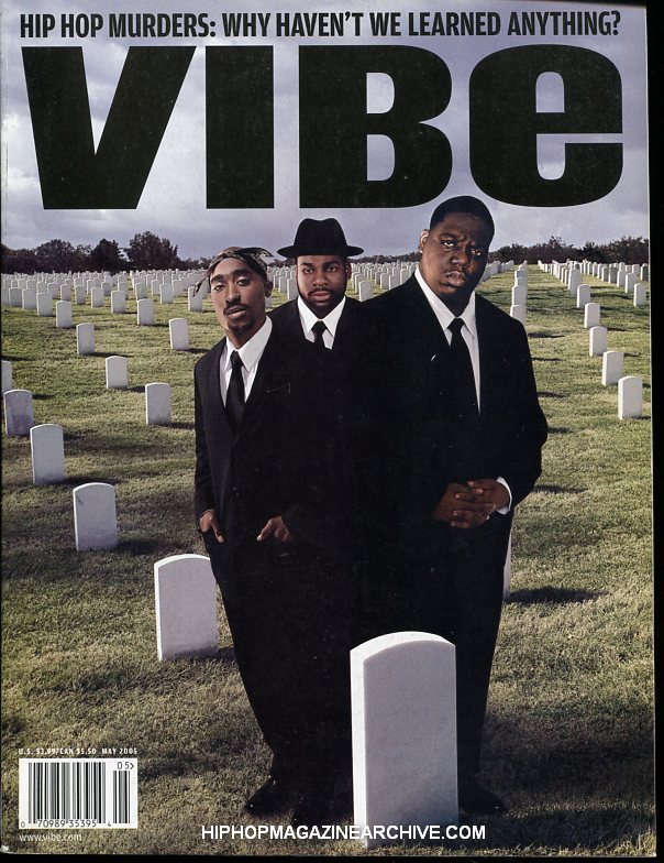
 These first two are very fashion orientated, especially clash which is a very stylish magazine, the model is using his look to get him places. Also i like the bold headings and large amounts of free space with no text in it. This is something I feel i can emulate well for my magazine.
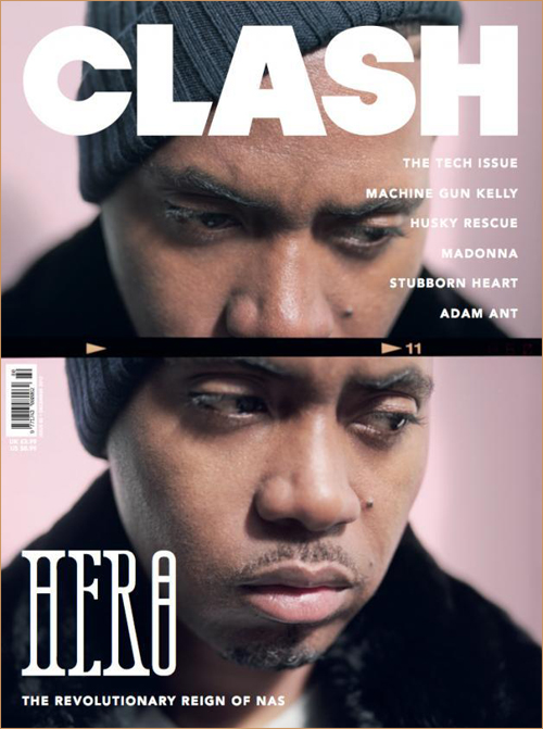
 These covers again are very minimal and have a look that is easy to recreate and still make look authentic. I want to make a real looking magazine and give it a fashionable edge on its competitors to impress and invite the target audiences money into purchasing something a bit different.
  The final two covers i looked at are less minimal but still have something to emulate. For example the shots are much more similar to what i want to use on my magazine because they show more of the artist without being too distant. also these both have a colour pallet i like.
Contents.


 The contents pages i looked at were all very smart and defined in the way that the text is layout alongside an image. Also they mainly include a single image which follows my minimal theme.
 As said above the single image is something i will hopefully use if possible as it looks minimal and focuses largely on the music artist involved. i also think this makes sure that the text and image mash up isn't too overwhelming and make the magazine look too cluttered. The layout i prefer is The Fader magazine '43' as it looks very stylish and on the brink of being a fashion magazine, widening the audience. However if i am to use this look it will need more text than i can see on it at the moment as there is little information.
Double page spread.


 These are all very similar to what I will hopefully recreate with a half image, half text DPS that has all the information but has free space to make it look cleaner. I feel that the use of headings in the last three very interesting and it breaks up the page rather that block text top to bottom. Out of these images I like the final two and I feel that they focus more on the artist rather than his look, i need this as the first images of Ben Hall i want to use are shots at distance which focus on style and the artist needs to be the focus in my article. Also from looking at these pages a pull quote is definitely needed on my image side of the page to make it more to look at than a plane image with endless white space surrounding it.
Looking through all of these pages from cover to DPS i feel that the smart look with hip-hop music and a touch of music can definitely be met. And to do this my shots need to be simple and a suit could be the outfit i use as most of the images above use a suit to smarten up the page and make the appear wealthy and therefore have the look that the audience for my magazine would like to try and emulate themselves.

2.jpg)


2.jpg)
