How did i use my inspiration?
(Using my blog post from 30th march 2013)
Cover.
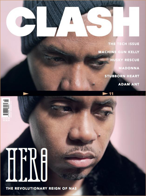
I used the look and style of these to get my final magazine to look like a real Hip-Hop magazine with a minimal look. For example the on the covers shown some have strap lines above the mastheads which relate to that magazine and i used this to my advantage when trying to attract my target audience. Also i used the style of smart clothing and black and white together to make the magazine fell worth the price. Also doing this meant that i could keep my ties having a fashion section within the music magazine. Finally as shown on Vibe and Clash there is only one headline that stands out to the reader which gives the Hip-Hop/minimal look that I was going for throughout.
Contents.
Here i have mainly gone for the look of The Fader magazine contents page as it is minimal and worked well with my images. However i did take strong inspiration from other, for example my draft was similar to the vibe ones and had an appealing look with the layout but did not contain enough textual information.
DPS.
The double page spread of my magazine has a very Hip-Hop feel about and has the language and colour pallet to make it feel very real. I wanted it to look like it could fit into almost any magazine and I think that i have done that. One thing i have taken from the 'Over here hustlin'' article is the use of a bold heading to grab attention, then i also used the quote like in Q and a different text colour like the bold in the Vibe Usher article for my interview questions. Finally i feel the Wiz Khalifa article has used it question 'How High?' to attract the audience well and so i used the idea at the start of my text.
Friday 10 May 2013
Friday 19 April 2013
Note to examiner
Examiner,
Thanks for taking time to look at my blog and go through my preliminary task, research and planning, product and evaluation. I hope that i have improved greatly since the start of the course.
Jack gogerty.
Thanks for taking time to look at my blog and go through my preliminary task, research and planning, product and evaluation. I hope that i have improved greatly since the start of the course.
Jack gogerty.
evaluation question 3
What kind of media institution might distribute “Label”?
My magazine will have its own printing/publishing company that will produce it monthly. The magazine will be made available in stores and will only be printed for certain places. It can also be accessed online and as an app via the app store, Google play store or amazon marketplace. Stores used as stockists of the magazine would be stores such as large supermarkets with dedicated magazine isles and specific music shops. Other places such as fashion stores could stock the product but only if they request it. Online advertising is how i would to get it first know on clothing sites and the likes of. App will be as a subscription service of roughly £40.00 a year subscription plus special issues free. Each monthly issue will be £4.00 and contain the glossy mag with a spine and pages glued in to make worth the money. It will be a high end magazine with 100+ pages inside and a special issue every 6 months that is costing £8.00. Other advertising would include it being advertised via social networking sites such as twitter and Facebook pages. [From blog]I got the idea above from other similar magazines such as vibe who also publish the magazines they sell themselves.
Also it can be distributed digitally via online stores for music and/or fashion and through the magazines own website. Another place that I would think it would be distributed is on app stores on a variety of platforms so that anyone can access it on the go. This fits in with my target market as they would be a majority of young males that will use mobile phones endlessly and always be online searching for upcoming music and clothing. Therefore i think thatthe decision to distribute a magazine like mine without a company is safe as not a lot need printing and so on like they would if it was a magazine aiming ata different audience.
Alsoi feelthatthis gives me the freedom to make the magazine more individual and unique than if i were to advertise and distribute it under a larger company. For exampleit will be completely designed and edited inside the business allowing for bigger risks to be taken in terms of paper style and colour.
Wednesday 17 April 2013
Tuesday 16 April 2013
Evaluation - What needs to be done?
I have so far completed:
- Q6 (technologies) as an animoto video.
- Q1 (conventions) as an upload on issuu.
- Q5 (audience) as a prezi.
- Q2 (social groups) via scribd document.
- Q3 (institution) as a voice over.
- Q4 (audience) on a you tube video.
- Q7 (preliminary) as an upload on slideshare.
Saturday 30 March 2013
Hip-Hop style magazine inspiration.
Cover.
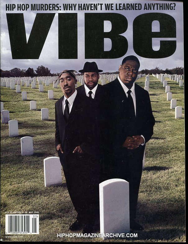
 These first two are very fashion orientated, especially clash which is a very stylish magazine, the model is using his look to get him places. Also i like the bold headings and large amounts of free space with no text in it. This is something I feel i can emulate well for my magazine.
 These covers again are very minimal and have a look that is easy to recreate and still make look authentic. I want to make a real looking magazine and give it a fashionable edge on its competitors to impress and invite the target audiences money into purchasing something a bit different.
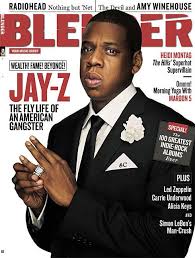
 The final two covers i looked at are less minimal but still have something to emulate. For example the shots are much more similar to what i want to use on my magazine because they show more of the artist without being too distant. also these both have a colour pallet i like.
Contents.


 The contents pages i looked at were all very smart and defined in the way that the text is layout alongside an image. Also they mainly include a single image which follows my minimal theme.
 As said above the single image is something i will hopefully use if possible as it looks minimal and focuses largely on the music artist involved. i also think this makes sure that the text and image mash up isn't too overwhelming and make the magazine look too cluttered. The layout i prefer is The Fader magazine '43' as it looks very stylish and on the brink of being a fashion magazine, widening the audience. However if i am to use this look it will need more text than i can see on it at the moment as there is little information.
Double page spread.


 These are all very similar to what I will hopefully recreate with a half image, half text DPS that has all the information but has free space to make it look cleaner. I feel that the use of headings in the last three very interesting and it breaks up the page rather that block text top to bottom. Out of these images I like the final two and I feel that they focus more on the artist rather than his look, i need this as the first images of Ben Hall i want to use are shots at distance which focus on style and the artist needs to be the focus in my article. Also from looking at these pages a pull quote is definitely needed on my image side of the page to make it more to look at than a plane image with endless white space surrounding it.
Looking through all of these pages from cover to DPS i feel that the smart look with hip-hop music and a touch of music can definitely be met. And to do this my shots need to be simple and a suit could be the outfit i use as most of the images above use a suit to smarten up the page and make the appear wealthy and therefore have the look that the audience for my magazine would like to try and emulate themselves.
These first two are very fashion orientated, especially clash which is a very stylish magazine, the model is using his look to get him places. Also i like the bold headings and large amounts of free space with no text in it. This is something I feel i can emulate well for my magazine.These covers again are very minimal and have a look that is easy to recreate and still make look authentic. I want to make a real looking magazine and give it a fashionable edge on its competitors to impress and invite the target audiences money into purchasing something a bit different. The final two covers i looked at are less minimal but still have something to emulate. For example the shots are much more similar to what i want to use on my magazine because they show more of the artist without being too distant. also these both have a colour pallet i like.Contents.
 The contents pages i looked at were all very smart and defined in the way that the text is layout alongside an image. Also they mainly include a single image which follows my minimal theme. As said above the single image is something i will hopefully use if possible as it looks minimal and focuses largely on the music artist involved. i also think this makes sure that the text and image mash up isn't too overwhelming and make the magazine look too cluttered. The layout i prefer is The Fader magazine '43' as it looks very stylish and on the brink of being a fashion magazine, widening the audience. However if i am to use this look it will need more text than i can see on it at the moment as there is little information.
Double page spread.
 These are all very similar to what I will hopefully recreate with a half image, half text DPS that has all the information but has free space to make it look cleaner. I feel that the use of headings in the last three very interesting and it breaks up the page rather that block text top to bottom. Out of these images I like the final two and I feel that they focus more on the artist rather than his look, i need this as the first images of Ben Hall i want to use are shots at distance which focus on style and the artist needs to be the focus in my article. Also from looking at these pages a pull quote is definitely needed on my image side of the page to make it more to look at than a plane image with endless white space surrounding it.
Looking through all of these pages from cover to DPS i feel that the smart look with hip-hop music and a touch of music can definitely be met. And to do this my shots need to be simple and a suit could be the outfit i use as most of the images above use a suit to smarten up the page and make the appear wealthy and therefore have the look that the audience for my magazine would like to try and emulate themselves.
Friday 22 March 2013
7
Looking backatmy prelim task i feel that i have learnt a lot. Starting with the abvious advance in the use of photoshop i have also had the ability to research far better than i ever have in the past. I think that the biggest improvement in my skills is the use of tech such as photoshop and blogger to put accrtoss my work.
6
- PHOTOSHOP: This was the main technology used in the production of my magazine as it was used to create the pages through a variety of functions. I also used this to edit photos into black white etc.
- CAMERA: I used the school camera which is a Nikon to take my images of ben in the light room using a canvas and tripod. The other things i used was another camera for the contents image.
- LIGHTING: Used when taking photos to create the correct affect with no shadows and an even tone all over the image.
- COMPUTERS: used for access to all of the website that i have used. It also gave me access to email word and photoshop programs that i needed to blog my work.
- PHONE: My phone was vital in getting the models to come to the right place at the right time, also I used it to take some sample photos of the contents before i arrived.
- SOUNDCLOUD: Used to upload a music playist in the research and planning section of my magazine blogger. This allowed mr to represent the audience/artists better.
- SCRIBD: Scribd was important for blogging and it allowed me to publish all of my word documents that i typed up onto the blog for my teacher to check.
- ANIMOTO: Used for my pitch.
- WORD: used to write up areas of my blog which were then uploaded to the blog via scribd.
- GOOGLE: Used for general access to all of the websites i have used whilst in the production of my magazine.
- UK TRIBES: used to help create and audience profile.
- COVERJUNKIE: research covers
- MAGPILE: research covers
- ISSUU: research other magazines for free.
- BLOGGER: to upload all of my work.
- MEMORY STICK: to transfer over my work from home and school.
- TWITTER: to communicate with the teacher for help and advice via the school twitter account.
EVALUATION 5.
 On my cover i included many aspects that would help to attract the target audience of my magazine. The most of these is the main image in which I have used high fashion which should get the correct audience to look through the magazine, another thing i have done along the lines of fashion include a Givenchy logo bottom right. This is important as i targeted a fashion orientated audience with money to spend. Also i have gone for a minimal look, conventional of many hip-hop magazines on the shelves already. The fonts i have used here are conventional for this genre as they are arty and have an edgy look that you could expect from something like graffiti art and other similar magazines such as _________. The final thing my cover does to attract the young male audience i have targeted is the use of black, white and red which give it a wealthy look and are rich colours.
2.jpg)
Friday 15 March 2013

Thursday 14 March 2013


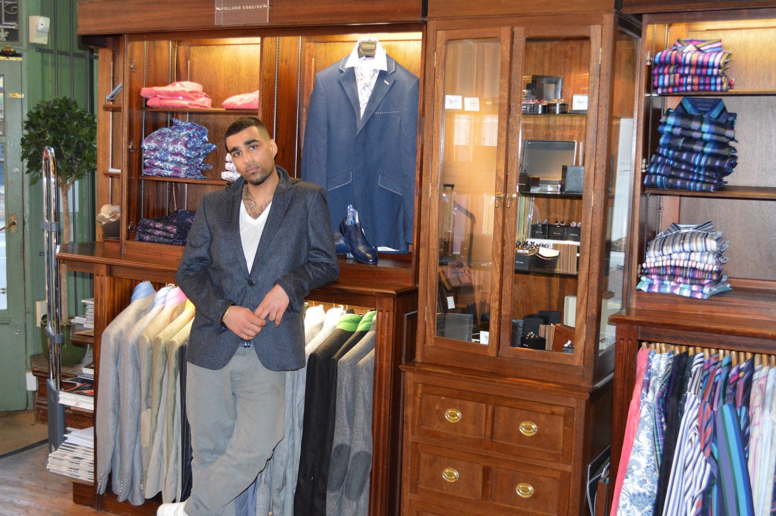


Contents (main photo)
As my story is about an upcoming artist (Ben Hall) i feel that my contents needs to show what is made out to be a well-known artist so that the magazine looks more realistic and authentic. Also in a real magazine a known artist is needed to help sell the product to the mass market. For this photo I plan to go to a designer clothing retailer that has a well furnished shop floor that has the right look for my magazine and as somewhere a Hip-Hop artist is likely to be seen.
For ideas on what i will do for this photo i researched the store and looked on a photographers website who has already taken photos at the shop for a past event that was held there. I used this link to get ideas of shots and angles to use on my contents so that i had a rough idea before i turned up to take pictures myself.
This is the link to the page with his photos:
http://edbrownphotography.co.uk/2013/02/13/christopher-scotney/


2.jpg)

Subscribe to:
Posts (Atom)